Renovation trend content mostly repeats what a paint brand or a tile factory published that year, so it's worth being specific about what's actually landing in real briefs, not just what's being marketed. Five things are showing up consistently across Malaysian interior design coverage and the projects we're seeing come through: a shift in design direction, one material behaviour (texture) doing more work than colour, and three practical material calls, on tiles, countertops and paint, that are less about trend-chasing than they look.
If you want these applied to your own home rather than read about, our interior design service starts with how you actually live, then brings in the material and finish decisions below where they fit. This page is the trend context behind that process. For where these material calls come from at the industry level rather than the brief level, see what ARCHIDEX 2026 signalled for Malaysian home design.
The design direction: warm Japandi has overtaken stark minimalism
Plain minimalism, the cool-grey, stark-white version that dominated the last several years, is being replaced by Japandi: Japanese restraint paired with Scandinavian warmth. It keeps minimalism's uncluttered surfaces and low visual noise, but swaps the cool palette for warm timber tones, linen, rattan and off-white, and it's now reported as the most searched and most executed residential style in Malaysia, particularly in condo-scale homes where a calmer, warmer palette does more to make a smaller space feel generous. The related "warm minimalism" label covers the same shift for landed homes: restrained forms, but with tactile materials like travertine, rattan and matte plaster standing in for a plain painted wall.
Texture is the real 2026 material trend, not a colour
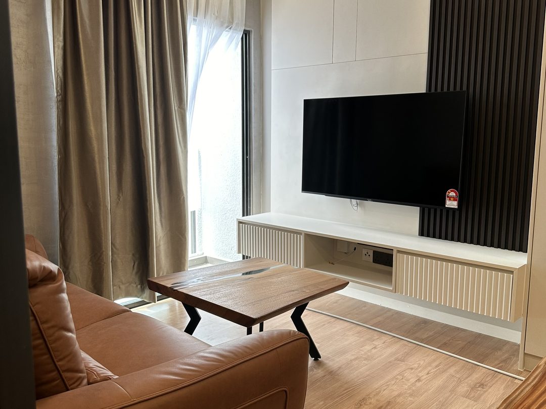
Across paint, wall treatment and furnishing coverage, the same pattern repeats: a flat, single-colour wall is being treated as unfinished. Fluted timber panelling, textured plaster, and tactile upholstery like bouclé are the most requested wall and furniture treatments for 2026, layered over a narrower, more muted colour palette rather than a bold one. The living room photo above is a straightforward example: a fluted panel media wall doing the visual work that a feature-colour paint job would have done a few years ago.
Tiles: large-format and matte, for reasons beyond looks
Floor and wall tile trends have converged on large-format slabs, commonly in the 750×1500mm to 1200×2400mm range, in marble-look porcelain or sintered stone. The appeal isn't only the seamless, high-end look: fewer grout lines means less mould-prone grout to maintain in a humid climate, and matte finishes are increasingly preferred over gloss for floors and wet areas specifically because they grip better underfoot and don't show water spots the way a polished finish does. Terrazzo has also come back, now favoured with larger chips and higher colour contrast than the fine, muted terrazzo of a decade ago.
| Tile choice | Why it's trending |
|---|---|
| Large-format marble-look porcelain | Minimal grout lines, visually expands a small space |
| Matte finish (floors, wet areas) | Better slip resistance, hides water spots |
| Bold terrazzo | Larger chips and higher contrast than the muted 2010s look |
Countertops: the question is now which zone, not which brand
Sintered stone, quartz and granite aren't really competing for the same job anymore. Sintered stone is being specified for wet kitchen counters and outdoor kitchen islands, where direct wok heat and UV exposure are hardest on a surface, since it tolerates heat up to roughly 300°C and won't fade outdoors the way quartz resin can. Quartz remains the sensible choice for a dry kitchen or a covered wet kitchen used with trivets, where its lower cost matters more than extreme heat tolerance. Granite is still specified, but it's losing share in new renovations to sintered stone, mainly because granite needs periodic resealing that the other two don't. For the full comparison, see our quartz vs sintered stone guide.
Paint: a colour-of-the-year is a mood, not a rule
Nippon Paint named Tree House, a muted deep green, its 2026 Colour of the Year, and Dulux built its 2026 palette around a family of blues rather than a single shade. Read together with the texture trend above, the pattern is warm, earthy, low-saturation colour used as an accent, on a feature wall or a single joinery run, not painted across an entire home the way a single "it" colour used to be marketed. A colour-of-the-year pick is a useful starting mood board, not a spec to follow blind; how a colour actually reads depends on your home's light, which is why we test it on your own wall before it goes on the quotation. For the full palette breakdown by room and by brand, see our 2026 paint colours guide.
A trend is a starting point, not a brief. Every material above has a real trade-off, cost, maintenance, or how it performs in Malaysia's heat and humidity, and that trade-off matters more to how the room holds up in five years than whether it matches this year's forecast. Use the trend list to shortlist options, then decide on the trade-offs, not the name.
Sources
The shift from minimalism to Japandi and warm minimalism is drawn from Clickbina's guide to Japandi interior design in Malaysia and Warmcazza's Japandi trend report. Texture and material trends, including fluted panelling and textured plaster, are drawn from Designed Design Associates' 2026 Malaysian trend report and Fatt Interior's 2026 trend list. Tile size, finish and terrazzo trends are drawn from Leo Ceramiko's 2026 Malaysian tile trends and Quickzone's tile trend guide. Countertop zoning by heat and UV exposure is drawn from Walton's sintered stone vs quartz comparison and Aurastone's Malaysian kitchen material guide. Paint colour-of-the-year picks are drawn from Nippon Paint Malaysia and Home Painting MY's 2026 colour trend roundup.
Read next: what ARCHIDEX 2026 signalled for home design · Paint colours for Malaysian homes in 2026 · Quartz vs sintered stone for a Malaysian kitchen · interior design · renovation materials