The colour-of-the-year ritual, and why it needs a Malaysian filter
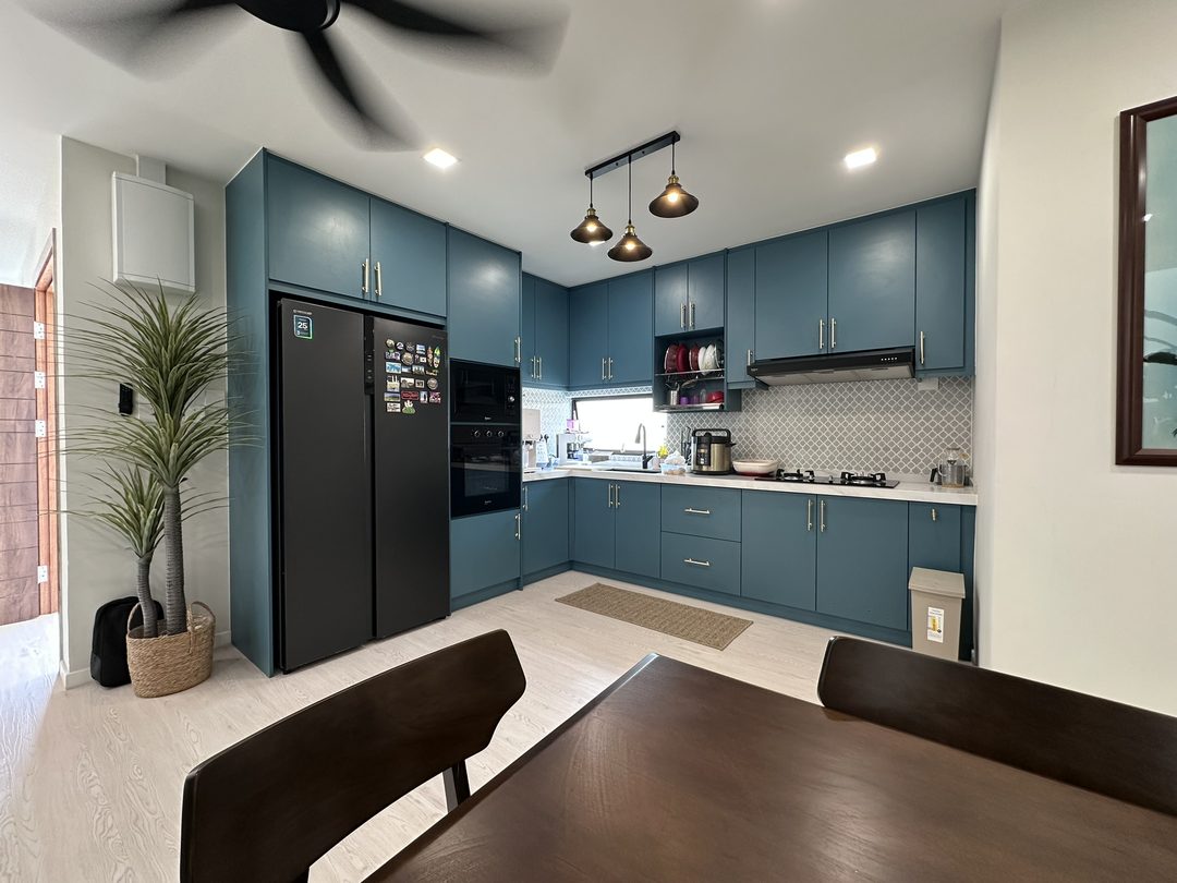
Every major paint brand names a colour of the year, and every year homeowners in Klang Valley see the announcement and the accompanying styled photography, usually shot in Scandinavian or European daylight that has almost nothing in common with equatorial sun. That does not make the colours wrong. It means the advice around them, which wall, which room, which light, needs a local read before it gets anywhere near a terrace house interior.
What the major brands picked for 2026
| Brand | 2026 pick | Description |
|---|---|---|
| Nippon Paint | Tree House (NP 8266) | A deep, grounded green with a subtle grey undertone, described by the brand as blending nature's greens with a whisper of serene mauve |
| Dulux | Rhythm of Blues (a family of three: Free Groove, Slow Swing, Mellow Flow) | The first time Dulux has named a colour family rather than a single shade, ranging from a vibrant royal blue to a deep navy to a soft sky blue |
| Jotun | Soulful Spaces collection (24 colours across three themes) | No single signature colour; the 2026 collection spans warm neutrals, greens and soft pinks organised into Passage of Time, Art of Stillness and Joyful Living |
| Pantone | Cloud Dancer (11-4201) | A soft, balanced white, positioned as a calming counterpoint to louder recent years' picks |
Read across all four, 2026 leans toward grounded, nature-adjacent tones (Tree House's green, the Soulful Spaces earth palette) alongside a confident return to saturated colour used carefully (Rhythm of Blues), rather than last decade's all-neutral, all-grey default.
Why "north-facing" advice from a foreign blog is the wrong instruction here
Most paint colour advice originates from temperate, higher-latitude markets, where the sun sits low and at an angle for much of the year, so a north-facing room gets cool indirect light and a south-facing room gets warm direct light, a genuinely useful distinction in London or Melbourne. Malaysia sits almost on the equator. The sun tracks close to directly overhead for most of the year, so compass direction matters far less than window size, external shading, and whether a neighbouring building or five-foot way blocks direct light. A "north-facing room stays cool and moody" rule imported wholesale from a UK design blog will steer a Malaysian homeowner toward the wrong colour for the actual light the room receives.
What matters more locally: how much direct tropical sun a wall gets during the parts of the day the room is actually used, and how deep the room is from its main window, since Klang Valley terrace and link houses are often long and narrow with light only entering from one end.
Which of the 2026 trends actually work in a small terrace interior
Nippon's Tree House works well as an accent in a living or dining area with reasonable natural light, its grey undertone keeps it from turning overly saturated under strong tropical sun, which is a common failure mode for green paints in this climate. It is a poor choice for a small, poorly lit room, where a deep green can read as cave-like rather than grounded.
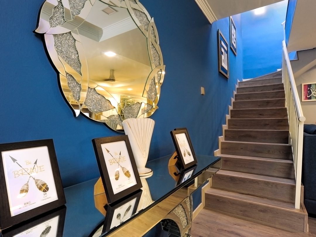
Dulux's Rhythm of Blues is genuinely three different colours with three different uses. The lighter sky-blue end reads calm and airy and can work across a full room with decent daylight. The navy end is dramatic and works best used selectively, a feature wall, a study nook, joinery, or a powder room, rather than wrapped around an entire enclosed bedroom where it can make a small space feel smaller under artificial light at night.
Jotun's Soulful Spaces palette, built around 24 colours rather than one, is the most flexible of the four for a small home simply because it offers a warm-neutral option for every room rather than forcing one saturated statement colour into a space that cannot support it.
Pantone's Cloud Dancer is the safest, most versatile pick of the four, a soft white that works in almost any Malaysian room regardless of light, though "safe" here means genuinely low-risk rather than exciting.
Sheen matters as much as the colour choice
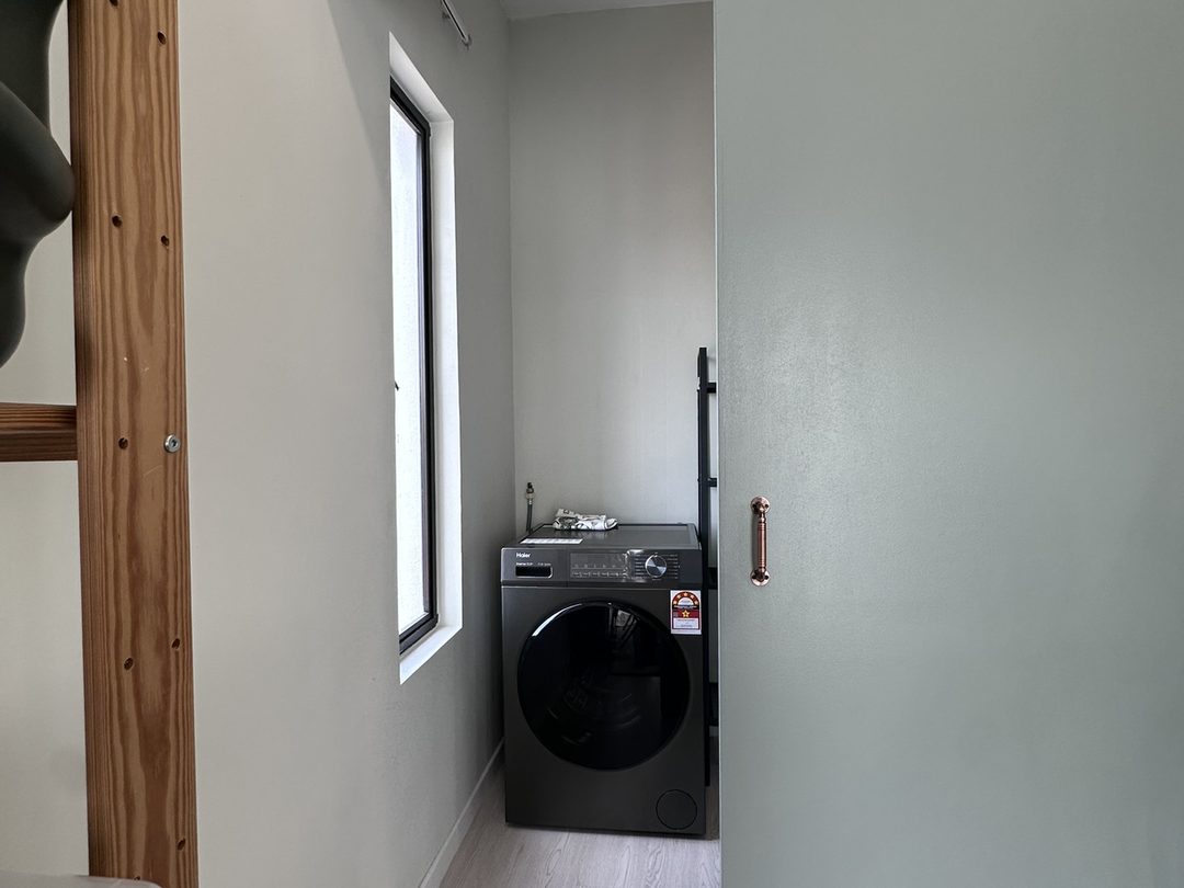
None of the above survives contact with a Malaysian bathroom or kitchen if the sheen is wrong. Matt and eggshell suit living rooms and bedrooms with normal airflow and no direct moisture exposure. Kitchens, bathrooms, and any room with poor ventilation need satin or semi-gloss, whose harder, less porous film resists condensation and wipes clean, ideally in an anti-mould formulation. This applies to every colour on this page equally, a beautiful Tree House green in a standard matt finish in a badly ventilated bathroom will develop the same mould and mildew problems as any other colour in the wrong sheen.
The wall nobody thinks about until it's peeling
Every colour discussion above assumes interior walls, but Malaysian facades take a harder beating than any interior surface, direct UV, driving monsoon rain, and the algae and fungus growth that thrives on a damp exterior wall in constant humidity. A standard interior emulsion used outdoors will chalk, fade and grow mould within a couple of years.
Purpose-built exterior ranges exist specifically for this. Nippon Paint's Weatherbond Ultimate, for example, is formulated with antimicrobial agents to resist mould, algae and fungus, UV-resistant pigments to hold colour intensity, and a reflective formulation the brand states can reduce surface temperature by around 5°C, which matters on a west-facing wall that takes direct afternoon sun for hours. Dulux's Weathershield range is positioned similarly, built around added protection against Malaysian weather rather than colour alone. Elastomeric exterior coatings go a step further structurally: acrylic-based and heat-reflective, with a flexible film that resists flaking and peeling as the wall expands and contracts with heat, and a self-cleansing surface that sheds algae and fungus growth rather than holding onto it. None of this changes which 2026 colour looks good, it changes whether that colour still looks good in three years instead of one.
How to actually test a colour before committing
- Paint a real sample patch, at least 30cm square, directly on the wall, not a small card held up against it.
- Test on two walls, one that gets direct sun during the day and one that doesn't. Tropical light is intense enough that the same colour can look markedly different between them.
- Look at it three times a day, morning, midday and evening, since equatorial daylight shifts colour temperature more sharply across a day than most people expect coming from temperate-climate advice.
- Check it under your actual room lighting at night, warm LED downlights shift a cool blue or green noticeably compared to daylight.
- Live with the patch for at least a few days before deciding. A colour that reads well on day one under a specific mood can read differently once it's the only thing in the room.
A colour scheme is one part of a room's overall feel, alongside layout, lighting and material choices, all of which come together properly in a considered interior design process rather than a single swatch decision made in a hardware store aisle.
Sources
Nippon Paint's 2026 colour of the year is from Nippon Paint Malaysia's official announcement. Dulux's Rhythm of Blues announcement is from Dezeen's coverage and Home & Gardens. Jotun's 2026 Soulful Spaces collection is from Jotun Malaysia's official colour chart page. Pantone's 2026 Colour of the Year is from CNN's coverage and NPR. Paint sheen recommendations for Malaysian humidity are from ClickBina's 2026 paint types guide and Seamaster Paint's finish guide. Exterior paint performance claims are from Nippon Paint Malaysia's Weatherbond article and Dulux Malaysia's Weathershield page.
Read next: Which renovation materials survive a Malaysian home · Quartz vs sintered stone for a Malaysian kitchen · Plaster ceiling vs skim coat, and when the cheaper one is fine · interior design